7 Tests Every Logo Needs to Pass for Scalability
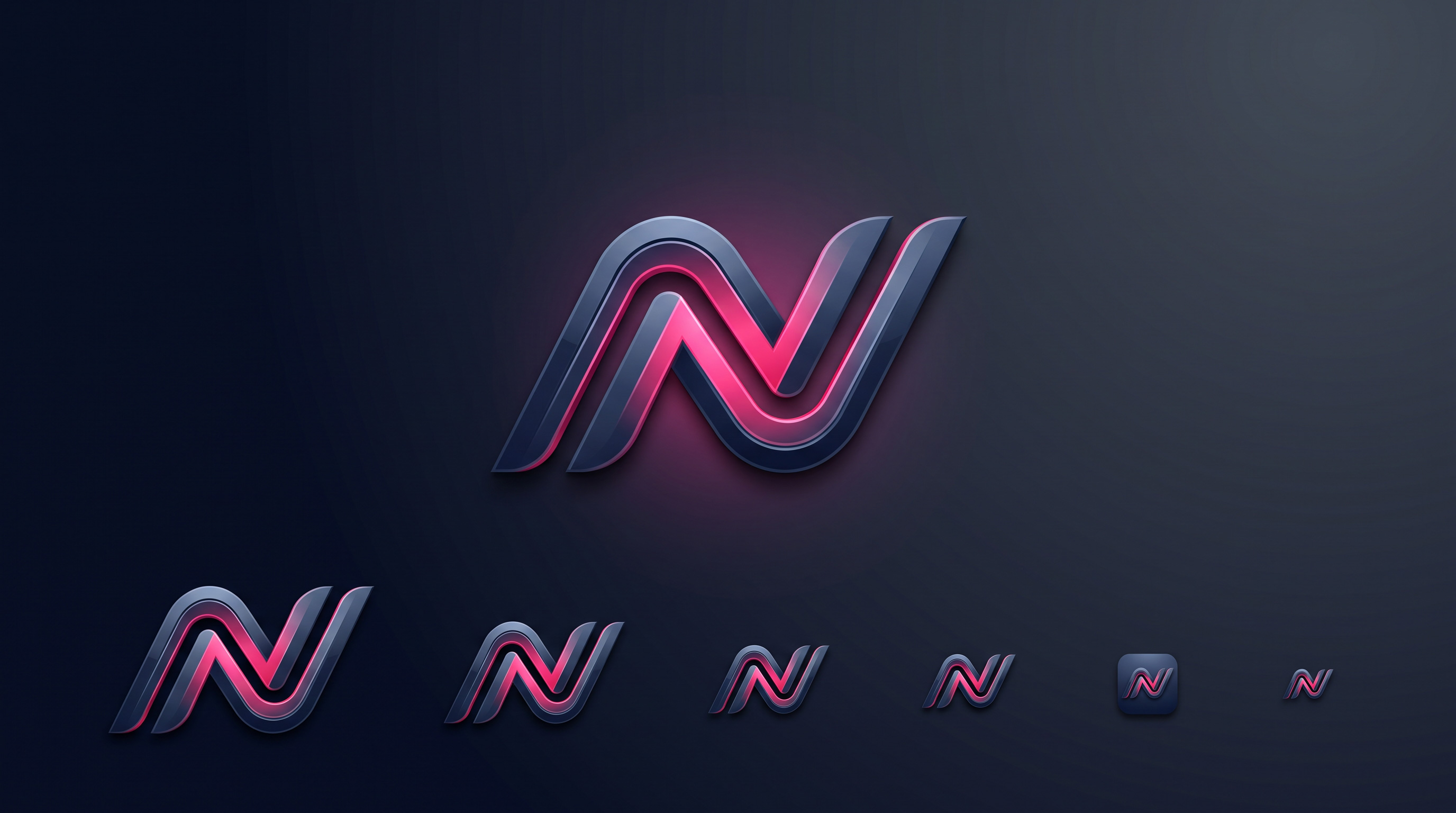
A logo has to look just as sharp on a highway billboard as it does as a 32-pixel favicon in a browser tab. If it falls apart when you shrink it, blur it, or strip its colour away, the design isn’t finished — it’s a picture that happens to work at one size. Scalability is what separates a logo that carries a brand for a decade from one you have to quietly redraw a year later. Here are seven practical tests every logo should pass before you sign it off.
Key takeaways
- A scalable logo works at any size, in one colour, and on any background.
- Test it small first — if it survives favicon size, it survives everywhere.
- Thin lines, tiny details, and too many colours are the usual points of failure.
- Always build in vector, never as a flat image — vectors scale without blurring.
- If a logo fails these tests, simplify it; don’t just shrink it and hope.
Why logo scalability actually matters
Your logo doesn’t get to choose where it appears. Over its life it will be embroidered onto a shirt, stamped on an invoice, printed on a delivery box, shrunk into a WhatsApp display picture, blown up on a shop sign, and squeezed into the corner of a mobile screen. A logo that only looks good at the size the designer showed you on their laptop is a liability, because in the real world it will spend most of its time small, single-colour, or sitting on a busy background.
When a logo breaks at small sizes or in awkward conditions, it quietly costs you credibility. A pixelated mark on a signboard or a muddy blur of a favicon makes even a serious business look amateurish. The good news is that scalability isn’t a matter of taste — it’s testable. Run your design through the seven checks below and you’ll know, objectively, whether it’s built to last or built to be redone.
1. It works in pure black and white
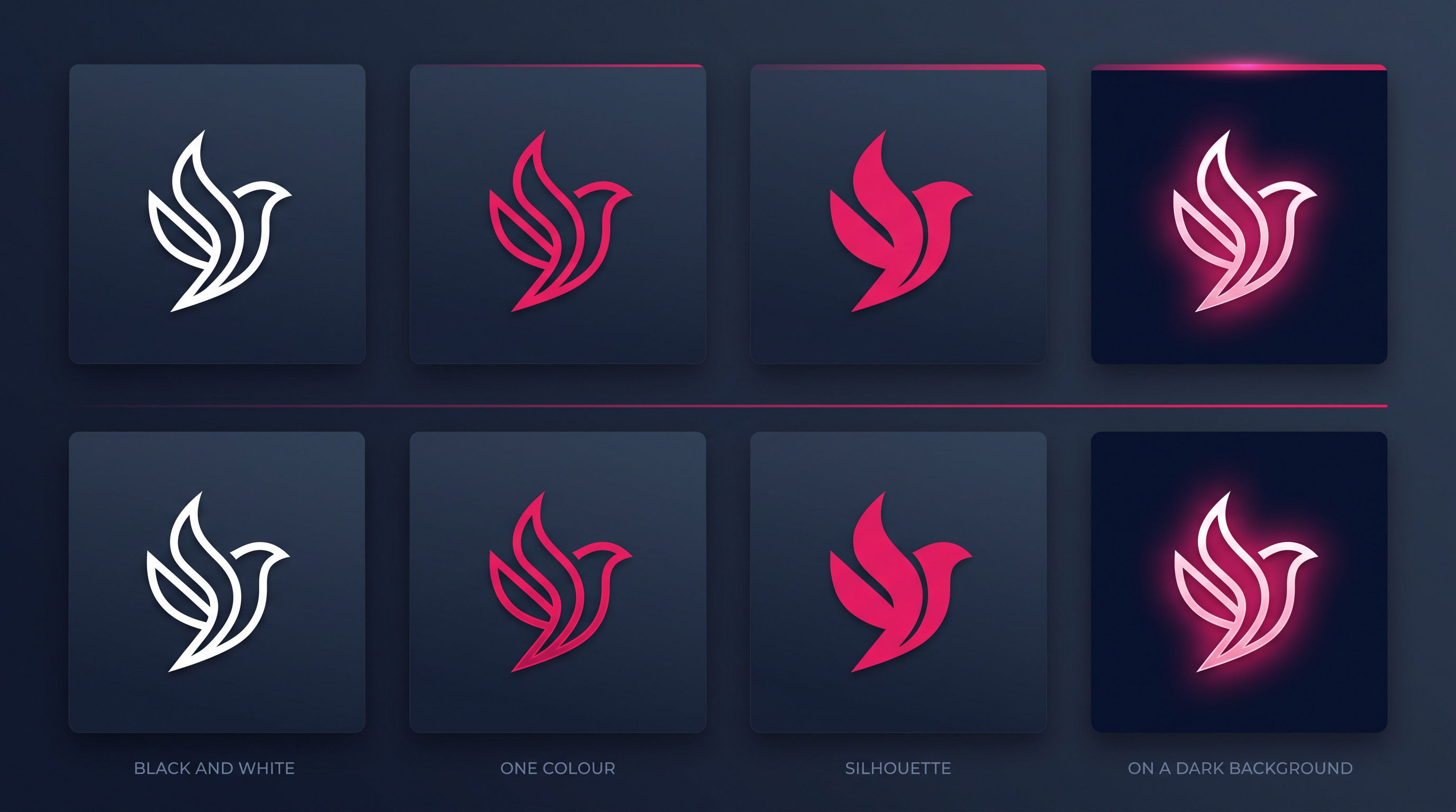
Strip every colour out of your logo and reduce it to solid black on white, then solid white on black. A strong logo is still completely recognisable, because its identity lives in its shape and structure — not in its colours. Colour is the finishing layer, and a mark that collapses without it never had a solid core to begin with.
This isn’t a theoretical exercise. Stamps, embroidery, engraving, fax, single-colour printing, and photocopies all reproduce your logo in one flat colour. If your design leans on a gradient or a specific colour pairing to be readable, it will fail every one of those uses. Ask your designer for a one-colour version as standard, and judge the logo on that version first.
2. It stays clear at favicon size
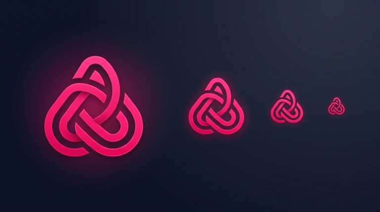
Shrink the logo down to roughly 32 by 32 pixels — the size of a browser-tab icon or an app badge — and look at it honestly. Can you still tell what it is? The most durable logos pass this test easily, because they were designed simple enough to survive it. If yours turns into an unreadable smudge, that’s not a rendering problem you can fix later; it’s a sign the design carries more detail than it can hold at small sizes.
Small is the hardest test, which is exactly why it’s the most useful. A logo that reads clearly as a favicon will read clearly everywhere else. When it fails, the fix is almost always to simplify: remove a detail, thicken a stroke, drop an element. Resist the urge to keep everything and just make the icon bigger — the small size is where your customers will most often see you.
3. It avoids ultra-thin lines
Hairline strokes look elegant on a big screen and disappear everywhere else. When a logo shrinks, the thinnest lines are the first thing to vanish — and the same happens in print, on embroidery, on packaging, and on any surface that can’t hold fine detail. A delicate line that renders perfectly at full size can simply drop out at a stamp or thumbnail size, leaving a broken-looking mark.
Aim for strong, consistent line weights that hold up when the logo is reduced. This is one of the most common reasons a beautiful-looking logo fails in the field, so test it deliberately: shrink the design right down and check whether every line is still visible. If parts thin out to nothing, the weights need rebalancing before the logo is fit for real use.
4. It uses a restrained palette of two or three colours
Too many colours create visual noise and make a logo harder to reproduce faithfully. A tight palette — usually one or two main colours plus perhaps a supporting tone — looks more premium, stays more memorable, and reproduces cleanly across every format from a printed receipt to a website header. It’s also cheaper and more reliable to print, because more colours mean more that can drift or misalign.
Restraint here pays off for years. A disciplined colour set becomes a recognition cue in its own right, and it forces the design to earn its impact through shape rather than a rainbow of hues. If your logo needs five colours to feel complete, it’s usually a sign the underlying mark isn’t strong enough — simplify the palette and the design almost always improves.
5. It’s built as a vector, not a flat image
This is the technical foundation of scalability. A vector file describes your logo as mathematical shapes, so it stays perfectly sharp at any size — from a business card to a building-sized banner. A raster image (a JPG or PNG) is a fixed grid of pixels; blow it up and you get blur and jagged edges. If your logo only exists as a flat image, you don’t really have a scalable logo at all.
Insist on receiving the editable vector source files when your logo is delivered — this is the single most important asset to own. Without vectors, you’ll be stuck the moment you need a large print, a signboard, or a clean version for a new use, and you may have to pay to have the logo redrawn from scratch. Vectors are what make every other test on this list possible.
A quick rule of thumb: if you can’t sketch your logo from memory in a few seconds, and it doesn’t survive being shrunk to thumbnail size in one colour, it’s too complex to scale reliably. Simplicity isn’t a limitation here — it’s the whole point.
6. It’s recognisable by silhouette
Fill your logo in as a single solid shape — no inner detail, no colour, just the outline — and see whether it’s still identifiably yours. The strongest logos have a distinctive silhouette, which is what lets people recognise them at a glance, from a distance, or in the corner of their eye. If your mark becomes an anonymous blob once the detail is removed, it’s relying on that detail far too heavily.
This test matters for scale because at small sizes and long distances, silhouette is often all the eye actually registers. A logo with a clear, ownable shape stays recognisable even when nothing else survives, while one built entirely from fine internal detail turns to mush. Distinctiveness of shape is one of the most reliable predictors that a logo will scale well.
7. It holds up on any background
Your logo will land on white, on dark, on brand colours, and on top of photographs. A scalable identity includes versions ready for all of these — a full-colour version, a reversed (white) version for dark backgrounds, and a single-colour version for when contrast is tricky. If your logo only works on the specific pale background it was designed on, it will look weak or invisible half the places it appears.
Test the design against the real surfaces it will meet: a dark website header, a coloured social template, a busy product photo, a printed page. A logo that stays legible and confident across all of them is genuinely versatile. Delivering these background variations as part of the logo package — rather than improvising them later — is a mark of a design that was built to be used, not just admired.
The bottom line
Scalability isn’t a nice-to-have; it’s the difference between a logo that serves your business quietly for years and one that keeps letting you down at the worst moments. Black and white, favicon size, line weight, a tight palette, vector construction, silhouette, and background flexibility — run your design through all seven, and you’ll catch the weaknesses before your customers do. When you’re briefing a designer, share this list; a good one will welcome it, because it’s exactly how they judge their own work. For the wider view on what makes a mark work, see our guide to what makes a good logo.
Want a logo built to scale?
We design logos in vector, test them at every size, and hand you every format — colour, reversed, and one-colour — plus the editable source files to keep. Tell us about your business and get a fixed quote within 24 hours.
Frequently asked questions
What file formats should I get with my logo?
At minimum: editable vector source files (such as AI, EPS, or SVG), plus exported PNGs with transparent backgrounds, a one-colour version, a reversed white version, and your exact colour codes and font names. The vectors are the most important — without them you can’t scale the logo cleanly for signage or large print.
Why does my logo look blurry when I enlarge it?
Almost always because you’re enlarging a raster image (a JPG or PNG) rather than using the vector file. Raster images are made of fixed pixels and blur when stretched. Ask your designer for the vector source, which stays perfectly sharp at any size.
How many colours should a logo have?
Keep it to two or three at most. A restrained palette looks more premium, is easier and cheaper to reproduce across print and web, and stays more memorable. If a logo needs many colours to feel finished, the underlying shape usually isn’t strong enough.
Can I test my own logo’s scalability?
Yes. Shrink it to about 32 pixels and check it’s still clear; convert it to plain black and white; place it on a dark background; and fill it as a solid silhouette to see if it’s still recognisable. If it passes all of those, it’s in good shape. If it fails any, the design needs simplifying.
Related articles
The 9 Core Brand Identity Elements Every Business Needs
A logo is only one piece. Learn the 9 core visual identity elements — logo, typography, colour, tagline, imagery, layout, textures, iconography…
Branding for Small Businesses in Pakistan: Where to Start
Branding for small businesses in Pakistan — what it really means, where to start on a tight budget, and how consistency beats…
What Makes a Good Logo? A Practical Guide for Pakistani Businesses
What actually makes a good logo — simplicity, scalability, timelessness, distinctiveness — and the files you must receive from your designer.