What Makes a Good Logo? A Practical Guide for Pakistani Businesses
Ask ten people what makes a good logo and you’ll get ten opinions, most of them about whether they personally like it. But a logo isn’t art — it’s a working tool with a job to do, and good ones follow principles you can actually judge against. This guide explains what makes a good logo, in practical terms, so you can brief a designer properly and know whether what you’re handed will still serve your Pakistani business in ten years.
Key takeaways
- A logo’s job is recognition, not decoration — simple beats clever every time.
- It must work at any size, in one colour, and on any background.
- Timeless design outlasts trends; a dated logo makes the business look dated.
- It should look distinct from your competitors, not blend in with them.
- Always get vector source files — without them, you don’t really own your logo.
What a logo is actually for
A logo doesn’t explain your business, list your services, or persuade anyone to buy. Its single job is to be recognised — so that when someone sees it on a shopfront, an invoice, a delivery box, or an Instagram post, they instantly know it’s you. Recognition is the whole point, and everything that makes a logo “good” flows from that.
This is why the most famous logos in the world are astonishingly plain. They aren’t trying to say everything about the company; they’re trying to be unmistakable at a glance. Once you accept that recognition is the goal, a lot of common logo arguments — about symbolism, cleverness, or cramming in what the business does — resolve themselves.
1. Simple enough to remember
Simplicity is the first and most important test. A logo with a detailed illustration, a gradient, a shadow, and a tagline may look impressive on a large screen, but it turns to mush as a social media profile picture or a stamp on a receipt. If someone couldn’t roughly sketch your logo from memory after seeing it a few times, it’s probably too complicated.
Simple doesn’t mean boring or lazy. It means every element earns its place. A good designer will strip away anything that isn’t doing a job — and that restraint is genuinely harder than adding more. When you’re reviewing concepts, resist the instinct to ask for “a bit more” detail; you’ll almost always be making it weaker.
2. It works everywhere, at every size
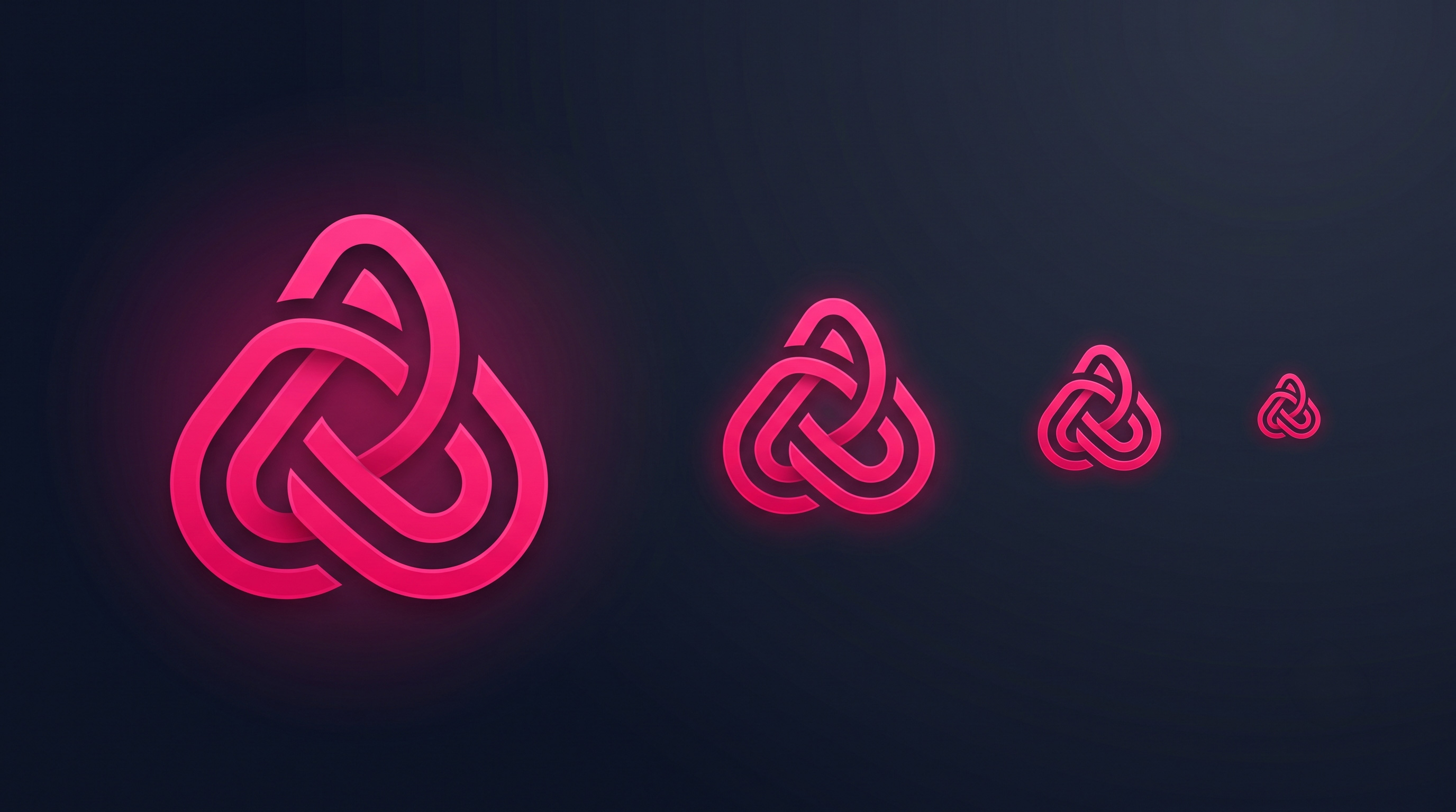
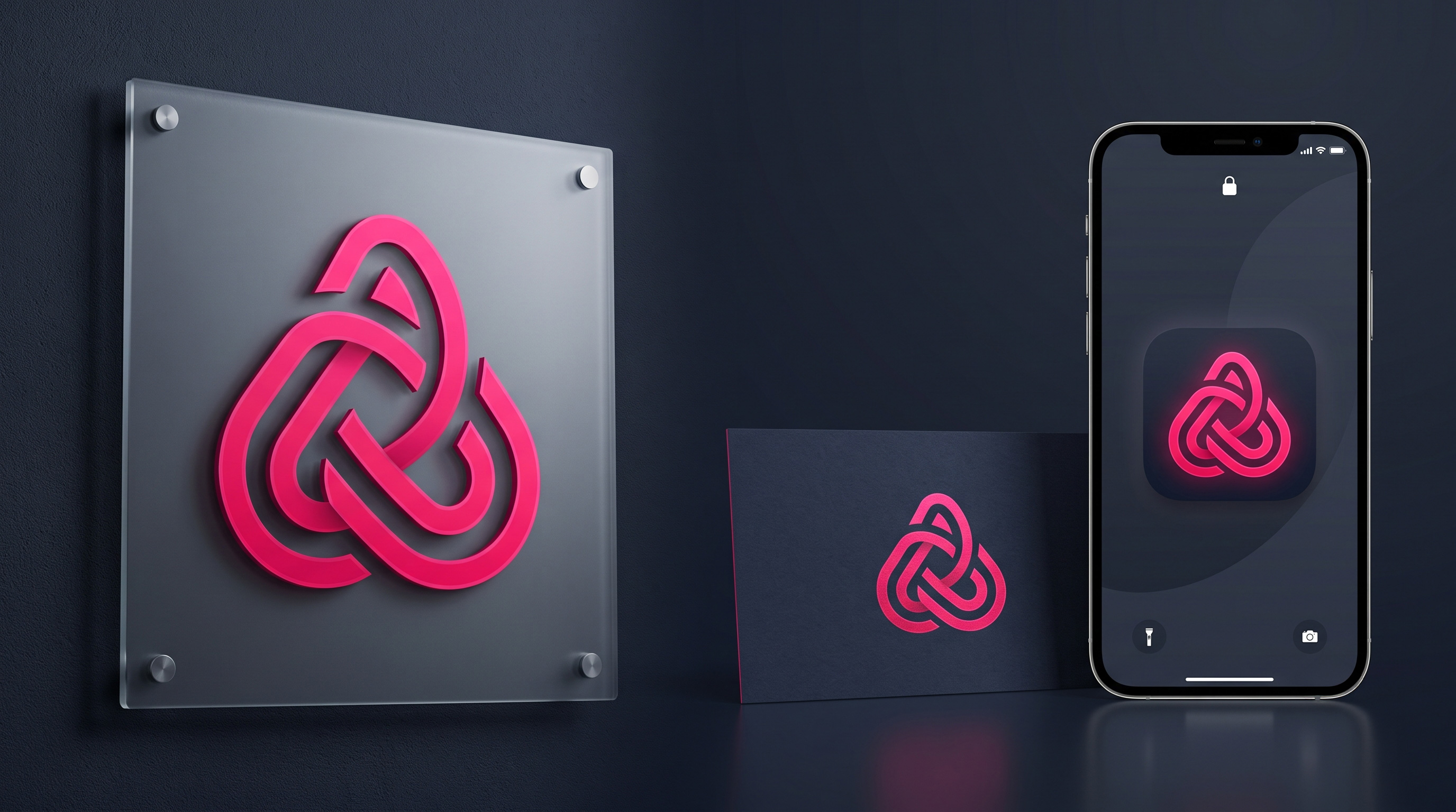
Your logo will live in wildly different places: a large signboard, a business card, a WhatsApp display picture, an embroidered shirt, a printed invoice, a website header. A good logo survives all of them. Test it small — shrink it to the size of a thumbnail and see whether it’s still legible and still recognisably yours.
It also needs to work in a single colour. Printing, stamps, embroidery, and faxed or photocopied documents often can’t reproduce colour, so your logo must hold up in plain black or white. If it collapses without its gradient, it isn’t finished. Ask for a one-colour version as standard, not as an afterthought.
3. Appropriate for your industry and audience
A logo should feel right for what you do. A law firm, a children’s clothing brand, and a construction company have very different audiences, and a logo that would delight one would undermine another. Playful, rounded lettering builds warmth for a bakery and destroys credibility for an accountant.
Think about who you’re trying to reach, not what you personally find attractive. This is the single most common source of bad logo decisions — the owner picks the concept they like rather than the one their customers will trust. Ask instead: does this look like a business my ideal customer would take seriously?
Your logo doesn’t have to illustrate what you sell: a bakery logo needn’t contain bread, and a transport company needn’t show a truck. Literal imagery often makes logos generic and limits you if your business expands. Distinctiveness matters more than description.
4. Timeless rather than trendy
Design trends move fast, and a logo built on whatever is fashionable this year will look obviously dated within a few. That matters commercially: a dated logo quietly signals a business that hasn’t kept up, even when the business itself is thriving. Rebranding is expensive and disruptive, so the goal is a logo you won’t need to replace.
The safest route is clean, well-proportioned type and simple shapes — the things that have looked good for decades and still will. A useful test when reviewing concepts: would this have looked reasonable ten years ago, and would it look reasonable ten years from now? If it only works right now, it’s a trend, not an identity.
5. Distinct from your competitors
A logo that looks like everyone else’s in your industry fails at its one job, because recognition requires difference. Before approving anything, look at what your direct competitors use — locally and nationally. If your logo could be swapped with theirs and nobody would notice, it isn’t working hard enough for you.
Being distinct doesn’t mean being strange. Often the difference comes from something small and deliberate: a particular colour nobody else in your sector uses, a specific lettering style, a simple mark used consistently. Small, confident differences compound into recognition over the years.
Colour and typography choices
Colour carries meaning and emotion, so choose it deliberately rather than by personal preference. Keep the palette tight — one or two main colours plus neutrals is plenty. More than that becomes hard to apply consistently across signage, packaging, and screens, and consistency is what builds recognition.
Typography matters just as much and gets far less attention. The lettering carries most of a logo’s personality, and it must stay legible when small. If you serve customers in Urdu as well as English, discuss bilingual lockups early — retro-fitting Urdu to a logo designed only in English rarely looks considered, and it’s much easier to plan for from the start.
What you should receive from your designer
This is where many Pakistani businesses get caught out. You should receive vector source files — the scalable originals — not just a JPG or PNG. Without vectors, your logo can’t be enlarged for a signboard, sent to a printer, or embroidered without going blurry, and any future designer has to redraw it from scratch.
Alongside the vectors you should get: horizontal and stacked versions, a one-colour version, a version for dark backgrounds, common raster formats for web and social, your exact colour codes, and the names of the fonts used. Confirm before you pay that the source files are included and the logo is yours to use without restriction.
Common logo mistakes to avoid
The mistakes repeat themselves. Cramming a tagline or phone number into the logo — those change, and they’re unreadable when small. Using generic clip-art or free icons that dozens of other businesses also use. Choosing the concept the owner’s family liked most rather than the one that suits the audience. Approving something without ever seeing it small or in one colour.
The most expensive mistake is paying very little for a logo and receiving only a low-resolution image file. It feels like a saving until you need a signboard, and you discover you have to pay again to have the whole thing rebuilt properly. Buy the source files the first time.
The bottom line
A good logo is simple, works at any size and in one colour, suits your audience, avoids trends, and looks distinct from your competitors. Judge concepts against those tests rather than personal taste, and you’ll choose far better than most business owners do. And insist on vector source files, because a logo you can’t scale isn’t really yours.
Remember that a logo becomes valuable through consistent use, not through being clever on day one. The mark itself matters less than the years of showing up looking the same everywhere your customers see you. Choose something clean and durable, then use it relentlessly — that’s what turns a logo into a brand people recognise.
Need a logo built to last?
We design timeless, versatile logos for Pakistani businesses — with every format for print and web, and the editable source files handed to you to keep.
Frequently asked questions
Should my logo show what my business does?
Not necessarily. Literal imagery often makes logos generic and can limit you if your business expands into other areas. Being distinct and memorable matters far more than being descriptive — most famous logos say nothing about what the company sells.
What files should I receive with my logo?
Vector source files above all, plus horizontal and stacked versions, a one-colour version, a version for dark backgrounds, web and social formats, your colour codes, and the font names. Without vectors you can’t scale the logo for signage or printing.
How often should a business change its logo?
As rarely as possible. Recognition is built through years of consistent use, so frequent changes reset that progress. A well-designed, timeless logo should last a decade or more, with at most a light refresh rather than a full redesign.
Can I design my logo myself with an online tool?
You can, and for a very early-stage business it’s better than nothing. Be aware that template-based tools often produce marks similar to thousands of others and may not give you proper vector files — which is exactly the problem you’ll hit when you order a signboard.
Related articles
7 Tests Every Logo Needs to Pass for Scalability
A logo must look sharp from billboard to favicon. Here are 7 practical tests — black and white, small size, line weight,…
The 9 Core Brand Identity Elements Every Business Needs
A logo is only one piece. Learn the 9 core visual identity elements — logo, typography, colour, tagline, imagery, layout, textures, iconography…
Branding for Small Businesses in Pakistan: Where to Start
Branding for small businesses in Pakistan — what it really means, where to start on a tight budget, and how consistency beats…