The 9 Core Brand Identity Elements Every Business Needs
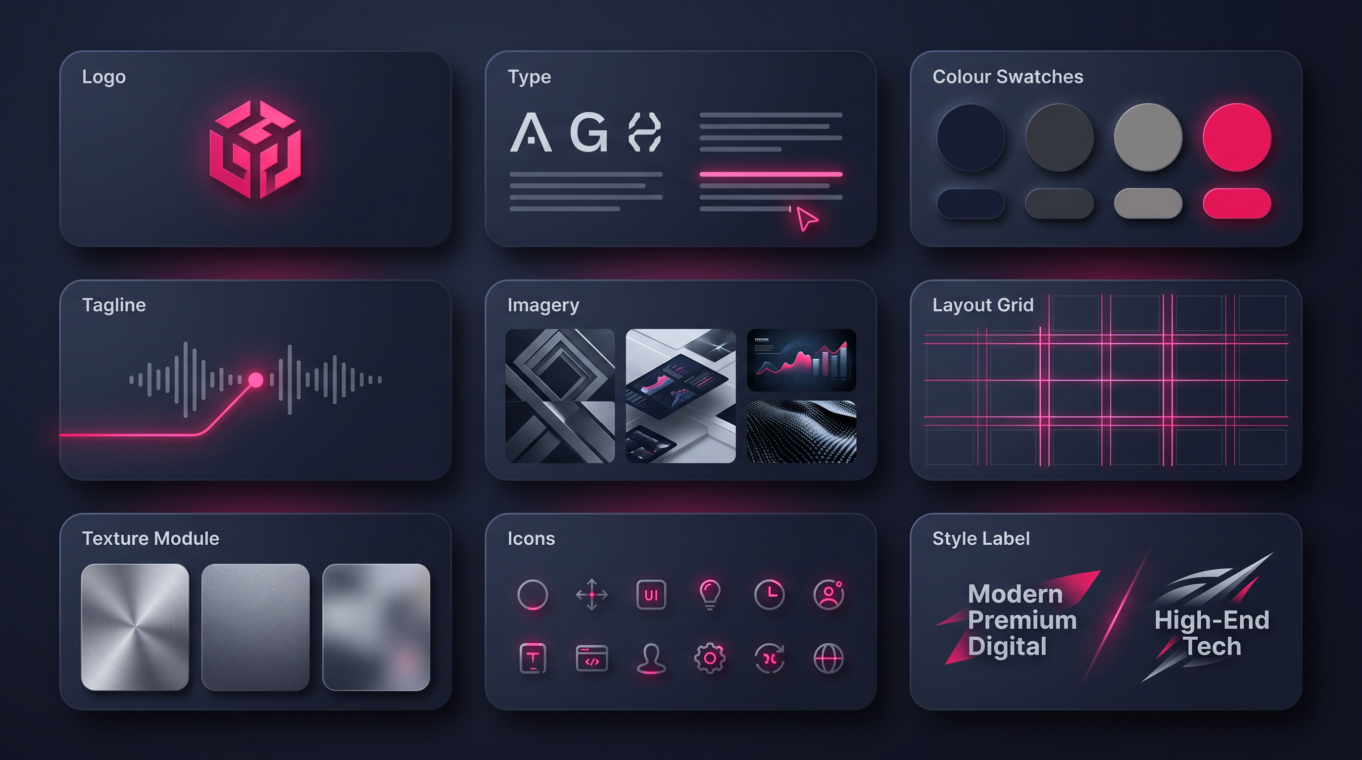
A logo gets all the attention, but on its own it can’t carry a brand. What actually makes a business feel recognisable, professional, and trustworthy is a whole system of visual elements working together — the same fonts, the same colours, the same look repeated everywhere a customer meets you. This guide breaks brand identity into its nine core elements, explains what each one does, and shows how a Pakistani business can build them into a brand people remember and trust.
Key takeaways
- A brand is a system, not a logo — nine elements work together to make you recognisable.
- Typography and colour do more day-to-day recognition work than the logo itself.
- Consistency is the whole game: the same choices, repeated everywhere, build trust.
- You don’t need all nine on day one — start with the core four and grow the system.
- Write the rules down in simple brand guidelines so everyone applies them the same way.
Why a logo alone is not a brand
Most business owners think branding starts and ends with a logo. It’s an understandable mistake — the logo is the visible bit, the thing you put on the signboard first. But think about the brands you personally recognise. You know them from their colours across a shelf, the shape of their lettering in an advert, the style of their photos on Instagram, long before you consciously read the logo. That instant recognition is the product of many elements repeated together, not one clever mark.
This matters for a small or growing business in Pakistan because trust is hard-won and easily lost. When your invoice, your website, your delivery packaging, and your social media posts all look like they came from the same company, you look established and dependable. When they look like they were made by five different people on five different days, customers quietly wonder whether you’ll be as inconsistent with their order. A visual identity system is how you close that gap. Here are the nine elements that make it up.
1. Logo — the face of your brand
The logo is still where identity begins. Its single job is recognition, so the best logos are simple, timeless, and versatile — they work as a tiny WhatsApp display picture and as a large shopfront sign, in full colour and in plain black. People may forget your business name, but a strong logo stays in memory and pulls the name back with it.
Resist the urge to cram everything you do into it. A logo doesn’t need to illustrate your product; it needs to be distinct and unmistakable at a glance. And always insist on the editable vector source files, because without them you don’t truly own your logo and can’t scale it cleanly for signage or print. If you want the deeper checklist, our guide on what makes a good logo covers it in full.
2. Typography — the fonts that speak first
Your fonts talk before your words do. A rounded, friendly typeface feels warm and approachable; a sharp serif feels formal and established; a heavy geometric font feels bold and modern. Choose type that matches your brand’s personality, then use it consistently — one font for headings and one for body text is usually all a small business needs.
Typography quietly does more recognition work than almost any other element, because text appears on every single thing you produce. When the same fonts show up on your website, your prices, your captions, and your printed material, everything starts to feel like one professional brand. Pick fonts that are readable at small sizes and that support the languages you use, and you build clarity and recognition at the same time.
3. Brand colours — emotion before words
Colour reaches people faster than any sentence. Before a customer reads a word, your palette has already suggested a feeling — trust and calm from blues, energy and appetite from reds and oranges, freshness and health from greens, premium restraint from black and gold. Choosing colours that reflect what your brand stands for is one of the highest-leverage decisions you can make.
The power, though, comes from discipline. Pick a small palette — usually one or two main colours plus a couple of supporting tones — and apply it everywhere without drifting. Note the exact colour codes so your website, your print shop, and your social designer all use precisely the same shade. Over time, the colour itself becomes a shortcut to your brand in the customer’s mind.
4. Tagline — your brand’s signature line
A tagline is the short phrase that sits beside your name and captures your promise. Done well, it tells a customer in a handful of words what you stand for or what you’ll do for them. A good tagline is clear, memorable, relevant, and easy to recall — the sort of line that sticks after a single reading.
Keep it honest and specific to you. Vague slogans that could belong to any business (“Quality you can trust”) do nothing, because they’re forgettable and interchangeable. Aim for something that only your business could truthfully say, and resist changing it often — a tagline builds recognition the same way a logo does, through steady repetition over years rather than clever reinvention.
5. Brand imagery — photos that belong together
The photos, illustrations, and graphics you use are as much a part of your identity as your logo. When your imagery shares a consistent style — the same kind of lighting, the same mood, the same treatment — everything you publish feels like it belongs to one confident brand. When you grab random stock photos in clashing styles, the brand looks scattered no matter how good the logo is.
You don’t need an expensive shoot to get this right. Decide on a simple, repeatable look — for many Pakistani businesses, clean, well-lit photos of real products or real people work far better than generic foreign stock imagery. The point is consistency: pick a visual style and stick to it, and your imagery starts to build trust and a premium perception on its own.
6. Layout system — structure that stays recognisable
Great brands look organised because they follow a layout system: a consistent way of arranging things, with balanced spacing and a clear hierarchy that guides the eye. When your logo always sits in the same place, your headings always look the same size, and your spacing stays even, every post and page becomes instantly recognisable as yours — even before anyone spots the logo.
For a small business, this can be as simple as a few social media templates and a standard document layout that everyone reuses. The discipline of reusing the same structure, rather than designing each piece from scratch, is what makes a modest brand look far larger and more professional than it is. Consistency of layout is one of the cheapest ways to look established.
7. Textures — patterns that become assets
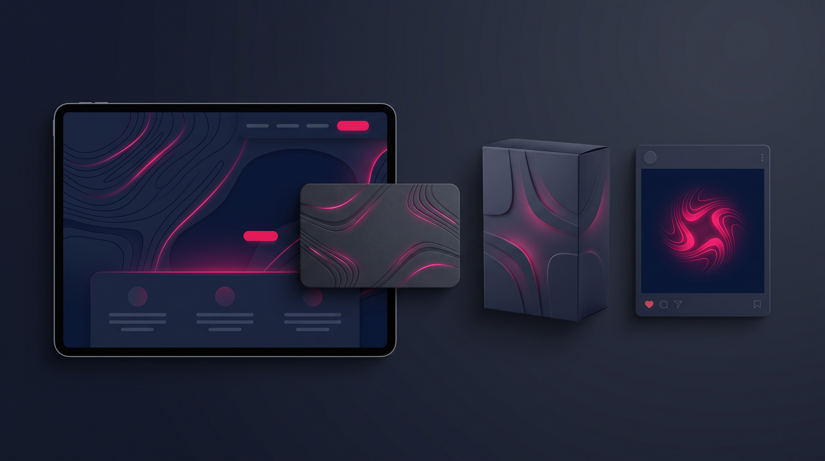
Textures and patterns are the finishing layer that adds depth and personality. A subtle background pattern, a signature graphic motif, or a distinctive line style can become an ownable brand asset — something customers start to associate with you even when your logo isn’t in view. Used well, a texture turns a plain design into an unmistakably branded one.
The key word is restraint. Textures work when they support the design quietly, not when they fight the content for attention. Think of a repeated pattern on your packaging or a consistent graphic accent across your social posts — small, deliberate touches that add richness without clutter. If it makes the design feel busy or hard to read, it’s doing more harm than good.
8. Iconography — the small details that feel premium
Icons are the little symbols that help people navigate and understand your content at a glance — the marks beside your services, features, or contact details. When they share one consistent style, whether outlined, filled, or rounded, they keep your visual identity intact and make communication faster. Mismatched icons pulled from different sources do the opposite, quietly cheapening an otherwise tidy design.
Custom or consistently-styled icons are one of those details customers rarely notice consciously but always feel. They signal care, and care reads as quality. On a website in particular, a coherent icon set makes the whole experience feel more premium and easier to use — a small investment that lifts the perceived value of everything around it.
9. Design style — one clear visual direction
Finally, every brand needs an overall design direction that ties the other eight elements together — a clear answer to whether you’re minimal, bold, luxurious, or playful. That direction is the personality behind every choice, and it’s what stops a brand from feeling like a random collection of nice-looking parts.
Once you’ve chosen your style, the job is to hold it everywhere the customer meets you: social media, your website, packaging, print, and marketing material alike. A brand that looks luxurious online but cheap in person breaks the trust it was building. Consistency across every touchpoint is what turns a good-looking business into one people actually remember and rely on.
You don’t need all nine on launch day: start with the core four — logo, typography, colours, and a clear design style — because those alone will make you look consistent. Add imagery rules, layout templates, textures, and iconography as your business grows and produces more material.
How to keep all nine consistent
Having nine strong elements means little if everyone who touches your brand applies them differently. The solution is simple brand guidelines — a short document that records your logo versions, your exact fonts and colour codes, your imagery style, and a few dos and don’ts. It doesn’t need to be a fifty-page manual; even a two-page reference keeps your designer, your printer, and your social media person pulling in the same direction.
Think of these guidelines as the rulebook that protects your investment. Every time someone makes a new post, prints a new flyer, or updates the website, the guidelines make it fast to stay on-brand and hard to drift off it. That steady consistency, maintained over months and years, is exactly what turns nine separate elements into a single brand customers trust. If pulling it all together feels daunting, a proper corporate branding process does precisely this — and it usually starts from a well-built logo and brand identity.
The bottom line
A memorable brand isn’t the result of one great logo; it’s the result of nine elements — logo, typography, colours, tagline, imagery, layout, textures, iconography, and an overall design style — applied consistently everywhere a customer meets you. Get the core four right first, write the rules down, and grow the system as you grow. Do that, and even a small Pakistani business can look established, feel trustworthy, and stay firmly in customers’ minds.
Ready to build a brand that stands out?
We help Pakistani businesses build complete visual identities — logo, typography, colours, and clear guidelines — so everything you put out looks like one trusted brand.
Frequently asked questions
What’s the difference between a logo and a brand identity?
A logo is a single mark; a brand identity is the whole visual system around it — fonts, colours, imagery, layout, and design style. The logo is the face, but it’s the consistent use of all the elements together that makes a business genuinely recognisable and trusted.
Which brand identity elements should a small business start with?
Start with the core four: a solid logo, chosen fonts, a defined colour palette, and a clear design style. Those four alone make everything you produce look consistent. You can add imagery rules, layout templates, textures, and custom icons as your business grows.
Do I really need brand guidelines for a small business?
Yes, even a short one. A two-page document recording your logo versions, fonts, colour codes, and a few dos and don’ts keeps your designer, printer, and social media person consistent. That consistency is what makes a small business look established and professional.
How much does a full brand identity cost in Pakistan?
It depends on scope — a logo with basic colours and fonts costs far less than a complete identity with imagery style, templates, and full guidelines. The best approach is to define what you need now and build outward. Share your requirements and we’ll send a clear, fixed quote within 24 hours.
Related articles
7 Tests Every Logo Needs to Pass for Scalability
A logo must look sharp from billboard to favicon. Here are 7 practical tests — black and white, small size, line weight,…
Branding for Small Businesses in Pakistan: Where to Start
Branding for small businesses in Pakistan — what it really means, where to start on a tight budget, and how consistency beats…
What Makes a Good Logo? A Practical Guide for Pakistani Businesses
What actually makes a good logo — simplicity, scalability, timelessness, distinctiveness — and the files you must receive from your designer.